Chart
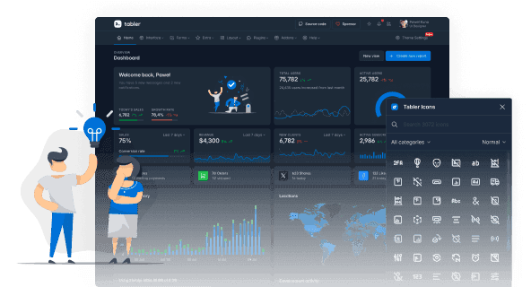
Tabler draws charts with ApexCharts and ships a container class, a color palette and theme tokens that make them match the interface.
Overview
Tabler draws charts with ApexCharts. ApexCharts renders the SVG and handles the data, and Tabler supplies the container class and a theme that makes the result match the rest of the interface.
Tabler does not initialize charts for you. You create each chart in JavaScript and point it at an empty element.
Installation
Install ApexCharts with npm:
npm install apexchartsyarn add apexchartspnpm install apexchartsbun install apexchartsOr include it from a CDN:
<script src="https://cdn.jsdelivr.net/npm/@tabler/[email protected]/dist/libs/apexcharts/dist/apexcharts.min.js"></script>ApexCharts draws with its own default colors, grid and tooltip. Tabler restyles all of it, and those styles live in the vendors plugin, so include tabler-vendors.css as well:
<link rel="stylesheet" href="https://cdn.jsdelivr.net/npm/@tabler/[email protected]/dist/css/tabler-vendors.min.css" integrity="sha384-b+YzQ3wbqkqeKY30ZsKxofcS71EsJ2Du59hAnd11P9/02pu1DSxkR2ynmwDHJA7U" crossorigin="anonymous" />License
Tabler bundles the built file in dist/libs so the examples work out of the box, but the license stays with ApexCharts. Read the ApexCharts license options before you use charts in a commercial product.
Usage
Add an empty element with the chart class, then pass it to ApexCharts. The class reserves a minimum height, so the card does not jump while the chart is loading.
<div id="chart-revenue" class="chart"></div>new ApexCharts(document.getElementById('chart-revenue'), {
chart: { type: 'line', fontFamily: 'inherit', height: 240 },
series: [{ name: 'Revenue', data: [37, 45, 32, 58, 41, 63] }],
}).render();Set fontFamily: 'inherit' so the chart labels use your interface font instead of the ApexCharts default.
Chart size
Set the height in the ApexCharts config, not in CSS. After it renders, ApexCharts writes its own min-height onto the container as an inline style, and that beats any height a class sets.
new ApexCharts(element, {
  chart: { type: 'line', height: 40 },
  // ...
}).render();
The size classes below reserve space before the chart renders, so the layout does not jump. Match the class to the height you pass to ApexCharts.
| Class | Reserved height |
|---|---|
chart |
10rem minimum, grows with the content |
chart-sm |
2.5rem, for a chart inside a table row or a list |
chart-lg |
15rem, for a chart that carries a whole card |
chart-square |
5.75rem, for a pie or radial chart next to text |
<div class="card">
  <div class="card-body">
    <div id="chart-demo-line-sm" class="position-relative chart-sm" role="img" aria-label="Small chart example"></div>
    <style>
      :root {
        --chart-demo-line-sm-color-0: color-mix(in srgb, transparent, var(--tblr-yellow) 100%);
        --chart-demo-line-sm-color-1: color-mix(in srgb, transparent, var(--tblr-green) 100%);
        --chart-demo-line-sm-color-2: color-mix(in srgb, transparent, var(--tblr-primary) 100%);
      }
    </style>
  </div>
</div>
Sparklines
A sparkline is a small chart with no axes, grid or tooltip, meant to sit inline next to a number. Use the chart-sparkline class and turn on the ApexCharts sparkline option.
<div class="chart-sparkline" id="sparkline-docs-sparkline-bar" aria-hidden="true"></div>
<div class="chart-sparkline" id="sparkline-docs-sparkline-line" aria-hidden="true"></div>
<div class="chart-sparkline chart-sparkline-square" id="sparkline-docs-sparkline-donut" aria-hidden="true"></div>
Add chart-sparkline-sm for a shorter sparkline, chart-sparkline-square for a pie or radial one, and chart-sparkline-wide when the default width is too narrow.
Colors
Tabler ships a five-color chart palette. Charts pick colors from it in order, so a chart with three series is colored without naming a single color.
| Variable | Default |
|---|---|
--tblr-chart-1 |
--tblr-primary |
--tblr-chart-2 |
--tblr-green |
--tblr-chart-3 |
--tblr-azure |
--tblr-chart-4 |
--tblr-purple |
--tblr-chart-5 |
--tblr-orange |
Override them to recolor every chart at once, the same way --tblr-primary recolors the rest of the interface:
:root {
  --tblr-chart-1: #7048e8;
  --tblr-chart-2: #f76707;
}
To color one series, pass the color in the ApexCharts config as usual:
new ApexCharts(element, {
  colors: ['var(--tblr-chart-2)'],
  // ...
}).render();
Theme tokens
ApexCharts reads its own design tokens from the chart element, and Tabler sets them to its theme colors. Text, gridlines and the chart surface follow the color mode on their own - including charts you build yourself, without any Tabler helper.
| Token | Used for | Tabler value |
|---|---|---|
--apx-fore |
labels, axis titles, legend | --tblr-secondary |
--apx-grid |
gridlines and axis lines | --tblr-border-color |
--apx-surface |
chart background | --tblr-bg-surface |
--apx-accent |
single-series color | --tblr-chart-1 |
--apx-series-1 … --apx-series-5 |
multi-series palette | --tblr-chart-1 … --tblr-chart-5 |
Set a token on a single card to change only that chart:
.card-dark-chart {
  --apx-grid: rgba(255, 255, 255, 0.1);
}
Chart types
See the ApexCharts documentation for the full list of options behind each of these.
Line chart
A line chart shows how values change over time, such as traffic or sales per day. This example has three series: session duration, page views and total visits:
<div class="card">
  <div class="card-body">
    <div id="chart-demo-line" class="position-relative" role="img" aria-label="Line chart example"></div>
    <style>
      :root {
        --chart-demo-line-color-0: color-mix(in srgb, transparent, var(--tblr-yellow) 100%);
        --chart-demo-line-color-1: color-mix(in srgb, transparent, var(--tblr-green) 100%);
        --chart-demo-line-color-2: color-mix(in srgb, transparent, var(--tblr-primary) 100%);
      }
    </style>
  </div>
</div>
Area chart
An area chart is a line chart with the space under the line filled in, which makes the size of each series easier to compare. This example has two series and smooth curves:
<div class="card">
  <div class="card-body">
    <div id="chart-demo-area" class="position-relative" role="img" aria-label="Area chart example"></div>
    <style>
      :root {
        --chart-demo-area-color-0: color-mix(in srgb, transparent, var(--tblr-primary) 100%);
        --chart-demo-area-fill-0: color-mix(in srgb, transparent, var(--tblr-primary) 16%);
        --chart-demo-area-color-1: color-mix(in srgb, transparent, var(--tblr-purple) 100%);
        --chart-demo-area-fill-1: color-mix(in srgb, transparent, var(--tblr-purple) 16%);
      }
    </style>
  </div>
</div>
Bar chart
A bar chart compares values across categories. This example stacks the bars, so each bar also shows the total:
<div class="card">
  <div class="card-body">
    <div id="chart-demo-bar" class="position-relative" role="img" aria-label="Bar chart example"></div>
    <style>
      :root {
        --chart-demo-bar-color-0: color-mix(in srgb, transparent, var(--tblr-purple) 100%);
        --chart-demo-bar-color-1: color-mix(in srgb, transparent, var(--tblr-green) 100%);
        --chart-demo-bar-color-2: color-mix(in srgb, transparent, var(--tblr-yellow) 100%);
        --chart-demo-bar-color-3: color-mix(in srgb, transparent, var(--tblr-red) 100%);
        --chart-demo-bar-color-4: color-mix(in srgb, transparent, var(--tblr-primary) 100%);
      }
    </style>
  </div>
</div>
Pie chart
A pie chart shows how a whole splits into parts. This example shows the share of each category:
<div class="card">
  <div class="card-body">
    <div id="chart-demo-pie" class="position-relative" role="img" aria-label="Pie chart example"></div>
    <style>
      :root {
        --chart-demo-pie-color-0: color-mix(in srgb, transparent, var(--tblr-primary) 100%);
        --chart-demo-pie-color-1: color-mix(in srgb, transparent, var(--tblr-primary) 80%);
        --chart-demo-pie-color-2: color-mix(in srgb, transparent, var(--tblr-primary) 60%);
        --chart-demo-pie-color-3: color-mix(in srgb, transparent, var(--tblr-gray-300) 100%);
      }
    </style>
  </div>
</div>
Heatmap chart
A heatmap encodes each value as a color, which makes a pattern in a large grid easy to see. This example shows a distribution across a grid:
<div class="card">
  <div class="card-body">
    <div id="chart-activity-heatmap" class="position-relative" role="img" aria-label="Heatmap chart example"></div>
    <style>
      :root {
        --chart-activity-heatmap-color-0: color-mix(in srgb, transparent, var(--tblr-green) 100%);
        --chart-activity-heatmap-color-1: color-mix(in srgb, transparent, var(--tblr-green) 100%);
        --chart-activity-heatmap-color-2: color-mix(in srgb, transparent, var(--tblr-green) 100%);
        --chart-activity-heatmap-color-3: color-mix(in srgb, transparent, var(--tblr-green) 100%);
        --chart-activity-heatmap-color-4: color-mix(in srgb, transparent, var(--tblr-green) 100%);
        --chart-activity-heatmap-color-5: color-mix(in srgb, transparent, var(--tblr-green) 100%);
        --chart-activity-heatmap-color-6: color-mix(in srgb, transparent, var(--tblr-green) 100%);
      }
    </style>
  </div>
</div>
Radar chart
Radar charts compare a few series across the same set of categories. They work best for scores and ratings, where every axis uses the same scale. Set chart.type to radar and pass the axis names in xaxis.categories:
<div class="card">
  <div class="card-body">
    <div id="chart-radar" class="position-relative" role="img" aria-label="Radar chart example"></div>
    <style>
      :root {
        --chart-radar-color-0: color-mix(in srgb, transparent, var(--tblr-primary) 100%);
        --chart-radar-color-1: color-mix(in srgb, transparent, var(--tblr-green) 100%);
      }
    </style>
  </div>
</div>
Polar area chart
A polar area chart is a pie chart where each slice keeps the same angle and grows outwards with its value. Use it when the parts of a whole differ a lot in size. Set chart.type to polarArea and pass plain numbers in series:
<div class="card">
  <div class="card-body">
    <div id="chart-polar-area" class="position-relative" role="img" aria-label="Polar area chart example"></div>
    <style>
      :root {
        --chart-polar-area-color-0: color-mix(in srgb, transparent, var(--tblr-primary) 100%);
        --chart-polar-area-color-1: color-mix(in srgb, transparent, var(--tblr-primary) 80%);
        --chart-polar-area-color-2: color-mix(in srgb, transparent, var(--tblr-primary) 60%);
        --chart-polar-area-color-3: color-mix(in srgb, transparent, var(--tblr-primary) 40%);
        --chart-polar-area-color-4: color-mix(in srgb, transparent, var(--tblr-primary) 20%);
      }
    </style>
  </div>
</div>
Treemap chart
Treemaps show parts of a whole as blocks. The bigger the value, the bigger the block, so they fit storage, budgets and other breakdowns with many entries. Set chart.type to treemap and pass { x, y } points, where x is the label:
<div class="card">
  <div class="card-body">
    <div id="chart-treemap" class="position-relative" role="img" aria-label="Treemap chart example"></div>
    <style>
      :root {
        --chart-treemap-color-0: color-mix(in srgb, transparent, var(--tblr-primary) 100%);
      }
    </style>
  </div>
</div>
Timeline chart
A timeline puts one bar per row between a start and an end date. Use it for roadmaps, releases and schedules. Set chart.type to rangeBar, turn on plotOptions.bar.horizontal, set xaxis.type to datetime and pass y as a [start, end] pair of timestamps:
<div class="card">
  <div class="card-body">
    <div id="chart-timeline" class="position-relative" role="img" aria-label="Timeline chart example"></div>
    <style>
      :root {
        --chart-timeline-color-0: color-mix(in srgb, transparent, var(--tblr-primary) 100%);
      }
    </style>
  </div>
</div>
Box plot chart
Box plots show how values spread out, not just their average. Each box covers the middle half of the data, the line inside it is the median, and the whiskers reach the lowest and highest values. Set chart.type to boxPlot and pass y as [min, q1, median, q3, max]:
<div class="card">
  <div class="card-body">
    <div id="chart-box-plot" class="position-relative" role="img" aria-label="Box plot chart example"></div>
    <style>
      :root {
        --chart-box-plot-color-0: color-mix(in srgb, transparent, var(--tblr-primary) 100%);
        --chart-box-plot-box-upper: color-mix(in srgb, transparent, var(--tblr-primary) 100%);
        --chart-box-plot-box-lower: color-mix(in srgb, transparent, var(--tblr-primary) 40%);
      }
    </style>
  </div>
</div>
Bubble chart
Bubble charts add a third value to a scatter plot: the size of the point. Set chart.type to bubble and pass { x, y, z } points, where z is the bubble size:
<div class="card">
  <div class="card-body">
    <div id="chart-bubble" class="position-relative" role="img" aria-label="Bubble chart example"></div>
    <style>
      :root {
        --chart-bubble-color-0: color-mix(in srgb, transparent, var(--tblr-primary) 100%);
        --chart-bubble-color-1: color-mix(in srgb, transparent, var(--tblr-green) 100%);
      }
    </style>
  </div>
</div>
Funnel chart
A funnel shows how many items are left at each step of a process. It is a horizontal bar chart with plotOptions.bar.isFunnel turned on. Turn on distributed as well, so every stage gets its own color, and keep the legend on, because a funnel hides the y-axis labels:
<div class="card">
  <div class="card-body">
    <div id="chart-funnel" class="position-relative" role="img" aria-label="Funnel chart example"></div>
    <style>
      :root {
        --chart-funnel-color-0: color-mix(in srgb, transparent, var(--tblr-chart-1) 100%);
      }
    </style>
  </div>
</div>
Advanced example
You can combine several series and custom options in one chart. This example shows referrals from Facebook, Twitter and Dribbble:
<div class="card">
  <div class="card-body">
    <div id="chart-social-referrals" class="position-relative" role="img" aria-label="Social referrals chart"></div>
    <style>
      :root {
        --chart-social-referrals-color-0: color-mix(in srgb, transparent, var(--tblr-facebook) 100%);
        --chart-social-referrals-color-1: color-mix(in srgb, transparent, var(--tblr-twitter) 100%);
        --chart-social-referrals-color-2: color-mix(in srgb, transparent, var(--tblr-dribbble) 100%);
      }
    </style>
  </div>
</div>
Axes, annotations and zoom
Two y-axes
Series with different units need their own scale. Pass an array to yaxis, bind each entry to a serie with seriesName, and set opposite on the second one to move it to the right side.
<div class="card">
  <div class="card-body">
    <div id="chart-revenue-vs-orders" class="position-relative" role="img" aria-label="Revenue in dollars and order count per month"></div>
    <style>
      :root {
        --chart-revenue-vs-orders-color-0: color-mix(in srgb, transparent, var(--tblr-primary) 100%);
        --chart-revenue-vs-orders-color-1: color-mix(in srgb, transparent, var(--tblr-green) 100%);
      }
    </style>
  </div>
</div>
Mixing shapes works the same way: give a serie its own type (column, line, area) and ApexCharts draws that serie differently from the rest.
Annotations
Annotations draw a line across the plot. Use annotations.yaxis for a target or a limit, and annotations.xaxis for a moment in time, like a release or a campaign.
<div class="card">
  <div class="card-body">
    <div id="chart-uptime-sla" class="position-relative" role="img" aria-label="Monthly uptime against the 99.9 percent service level target"></div>
    <style>
      :root {
        --chart-uptime-sla-color-0: color-mix(in srgb, transparent, var(--tblr-primary) 100%);
      }
    </style>
  </div>
</div>
Each annotation takes a value, a borderColor and an optional label. On a category axis the value is the category name, on a datetime axis it is a timestamp.
<div class="card">
  <div class="card-body">
    <div id="chart-sales-with-markers" class="position-relative" role="img" aria-label="Monthly sales with campaign start markers"></div>
    <style>
      :root {
        --chart-sales-with-markers-color-0: color-mix(in srgb, transparent, var(--tblr-primary) 100%);
        --chart-sales-with-markers-fill-0: color-mix(in srgb, transparent, var(--tblr-primary) 16%);
      }
    </style>
  </div>
</div>
Brush and zoom
A brush is a small chart that picks the range of a bigger one. Give the main chart an id, then point the small one at it with chart.brush, and set the starting range in chart.selection. Render the main chart first - the brush looks its target up by id.
<div class="card">
  <div class="card-body">
    <div id="chart-traffic-zoom" class="position-relative" role="img" aria-label="Sessions over 90 days, zoomed to the selected range"></div>
    <style>
      :root {
        --chart-traffic-zoom-color-0: color-mix(in srgb, transparent, var(--tblr-primary) 100%);
        --chart-traffic-zoom-fill-0: color-mix(in srgb, transparent, var(--tblr-primary) 16%);
      }
    </style>
    <div id="chart-traffic-brush" class="position-relative" role="img" aria-label="Range selector for the sessions chart"></div>
    <style>
      :root {
        --chart-traffic-brush-color-0: color-mix(in srgb, transparent, var(--tblr-primary) 100%);
      }
    </style>
  </div>
</div>
Synced charts
Charts that share a chart.group name move together. Hover one and the others show the same point, zoom one and the others follow. Every chart in the group needs its own chart.id and the same x values.
<div class="card">
  <div class="card-body">
    <div id="chart-synced-visits" class="position-relative" role="img" aria-label="Daily visits"></div>
    <style>
      :root {
        --chart-synced-visits-color-0: color-mix(in srgb, transparent, var(--tblr-primary) 100%);
        --chart-synced-visits-fill-0: color-mix(in srgb, transparent, var(--tblr-primary) 16%);
      }
    </style>
    <div id="chart-synced-signups" class="position-relative" role="img" aria-label="Daily sign-ups"></div>
    <style>
      :root {
        --chart-synced-signups-color-0: color-mix(in srgb, transparent, var(--tblr-green) 100%);
      }
    </style>
    <div id="chart-synced-revenue" class="position-relative" role="img" aria-label="Daily revenue"></div>
    <style>
      :root {
        --chart-synced-revenue-color-0: color-mix(in srgb, transparent, var(--tblr-azure) 100%);
      }
    </style>
  </div>
</div>
Legend key
ApexCharts draws its own legend, but you can also build a plain-HTML legend next to a chart's title - for example to label the series above the chart instead of below it. Use the Legend component: a legend-list of legend elements, colored with legend-{color}.
<div class="legend-list">
  <span class="legend legend-primary">
    <span class="legend-dot"></span> This year
  </span>
  <span class="legend legend-secondary">
    <span class="legend-dot"></span> Last year
  </span>
</div>
Accessibility
A chart is a picture, and a screen reader reads the SVG inside it as a pile of numbers and labels in drawing order.
- Give the container
role="img"and anaria-labelthat says what the chart shows. That replaces the SVG contents with one sentence. - Do not let color carry the meaning on its own. ApexCharts labels each series in its legend, so keep the legend on, or label the series in text next to the chart.
- Put the same numbers somewhere readable - a table, a caption, or the summary line above the card. That serves screen reader users and anyone who prints the page.
- Charts animate on first render. Set
chart.animations.enabled: falsewhen the page respectsprefers-reduced-motion.
<div
  id="chart-revenue"
  class="chart"
  role="img"
  aria-label="Monthly revenue, January to June 2026"
></div>
CSS
Sass variables
Override these variables before importing Tabler to change the defaults. Source: core/scss/_variables.scss.
$chart-min-height: 10rem;
$chart-height-sm: 2.5rem;
$chart-height-lg: 15rem;
$chart-height-square: 5.75rem;
$chart-sparkline-width: 4rem;
$chart-sparkline-height: 2.5rem;
$chart-sparkline-height-sm: 1.5rem;
$chart-sparkline-width-square: 2.5rem;
$chart-sparkline-width-wide: 6rem;
$chart-sparkline-label-icon-size: 1rem;