Icon design guide
The rules every Tabler icon follows — a 24×24 canvas, a 2 px centered stroke, round joins and caps, and fixed padding, radius and spacing. It also covers the SVG format, icon names and how to request a new icon.
All Tabler Icons follow the same set of design rules. This keeps the collection consistent, so icons look like they belong together at any size. Follow these rules when you draw your own icons to use next to Tabler Icons, or when you sketch an icon for a request.
Canvas
Design every icon on a 24×24 pixel canvas. This is the standard size for most icon sets and the one best supported in web and mobile apps. The same canvas for every icon keeps the set uniform and easy to scale.
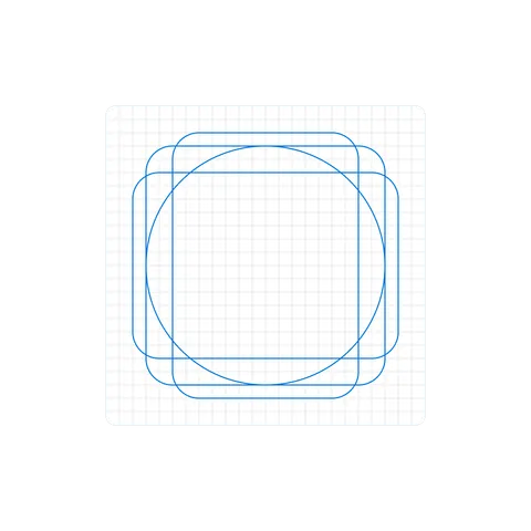
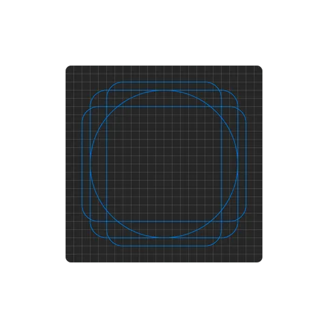
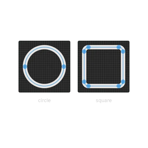
Start from the keyline shapes: a circle, a square, a wide rectangle and a tall rectangle. Draw a round object on the circle, a square one on the square and a wide or tall one on a rectangle. Different shapes then look the same size next to each other. The lines mark the center of the stroke.
Padding
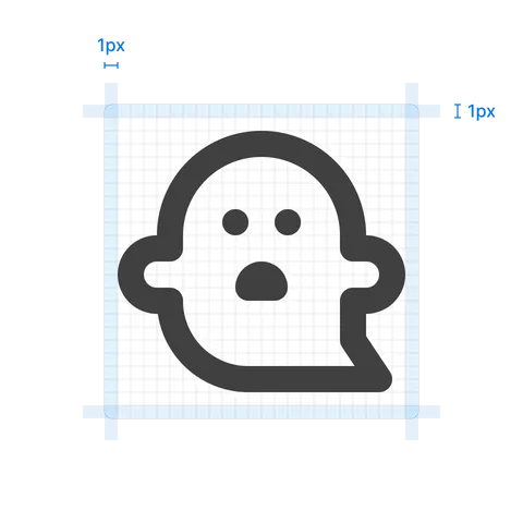
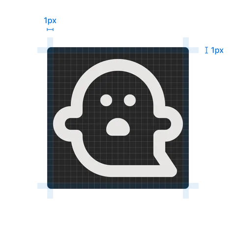
Leave at least 1 pixel of padding between the icon and the edge of the canvas. The icon then never touches its container and stays clear at small sizes.
Stroke width
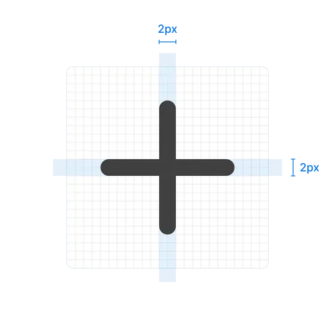
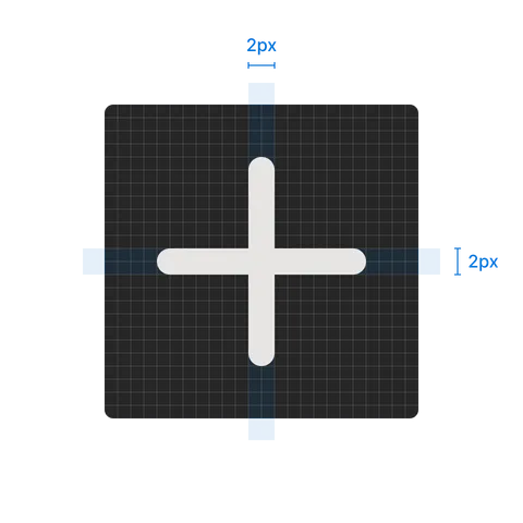
Draw icons with a 2 pixel stroke. The same line weight across the set makes icons look balanced and easy to read.
Round joins
Use round joins where lines meet. Corners between lines and curves then look smooth and match the rest of the set.
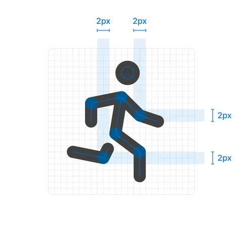
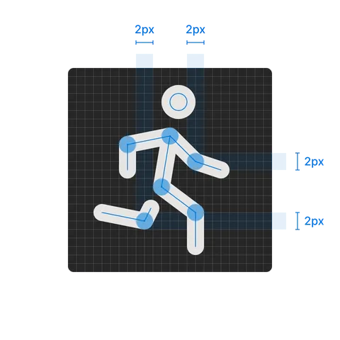
Round caps
Use round caps at the open ends of lines. They give icons a soft, friendly look.
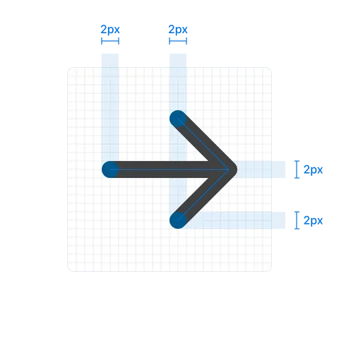
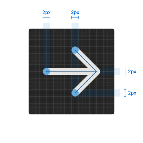
Centered strokes
Center the stroke on the path, not inside or outside it. This keeps shapes symmetric and their size predictable.
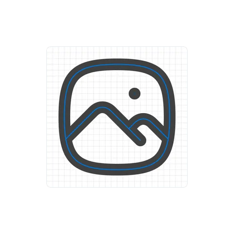
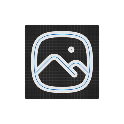
Corner radius
Give shapes such as rectangles a 2 pixel corner radius. Soft corners match the round joins and caps.
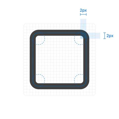
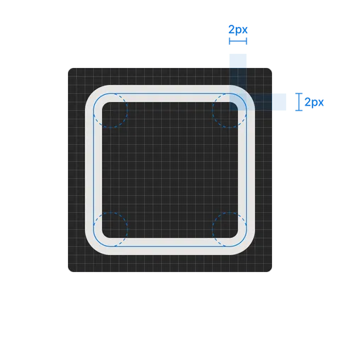
Spacing
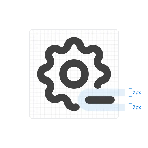
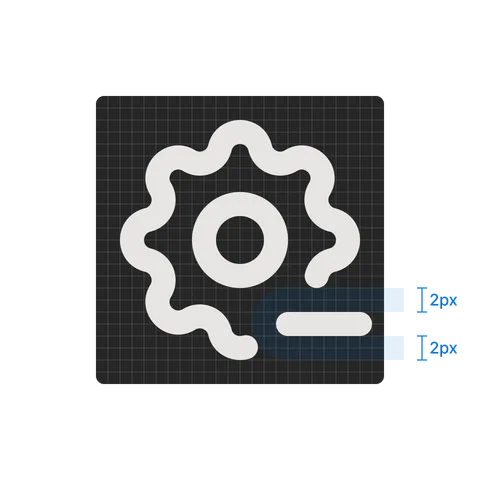
Keep 2 pixels of space between separate elements of an icon. The parts stay distinct and the icon stays readable at small sizes.
Accessibility
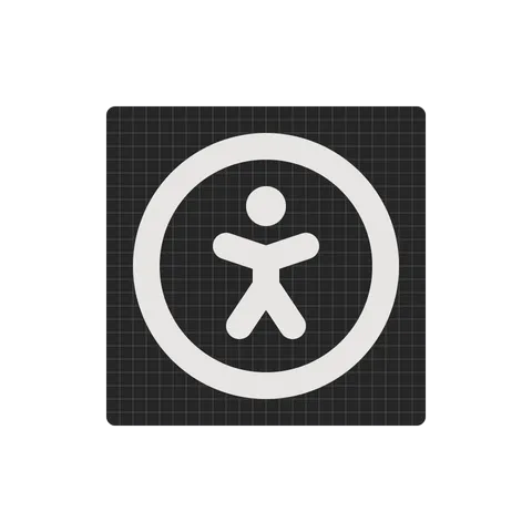
Make icons easy to tell apart, including for people with low vision. Use shapes with clear contrast and avoid icons that differ only in small details.

Export to SVG
Save every icon as a plain SVG file. Put the stroke settings on the <svg> element, so the icon takes its color from the text around it and can be restyled with CSS:
- Set
width,heightandviewBoxto24and0 0 24 24. - Set
fill="none"andstroke="currentColor". Do not use fixed colors. - Set
stroke-width="2",stroke-linecap="round"andstroke-linejoin="round". - Draw every shape as a
<path>, including circles and rectangles. - Remove groups, transforms, masks, clip paths and IDs that your design tool adds.
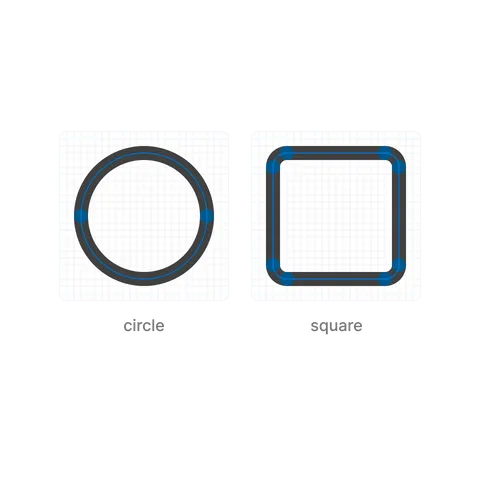
A circle is two arcs and a rounded square is four lines joined by four arcs. The marks show the points where the path changes direction.
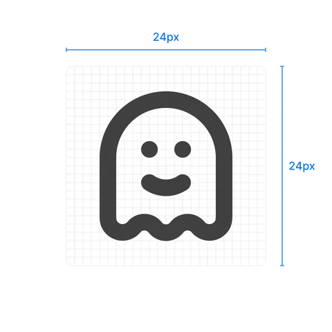
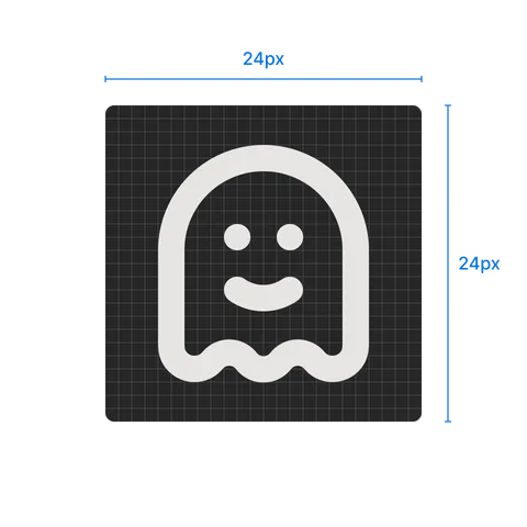
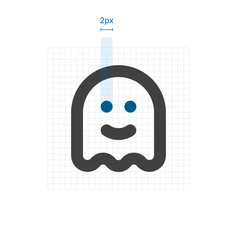
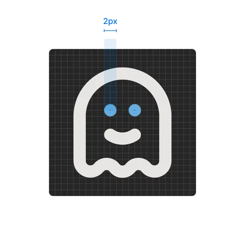
This is the ghost icon from the set:
<svg
  xmlns="http://www.w3.org/2000/svg"
  width="24"
  height="24"
  viewBox="0 0 24 24"
  fill="none"
  stroke="currentColor"
  stroke-width="2"
  stroke-linecap="round"
  stroke-linejoin="round"
>
  <path d="M5 11a7 7 0 0 1 14 0v7a1.78 1.78 0 0 1 -3.1 1.4a1.65 1.65 0 0 0 -2.6 0a1.65 1.65 0 0 1 -2.6 0a1.65 1.65 0 0 0 -2.6 0a1.78 1.78 0 0 1 -3.1 -1.4v-7" />
  <path d="M10 10l.01 0" />
  <path d="M14 10l.01 0" />
  <path d="M10 14a3.5 3.5 0 0 0 4 0" />
</svg>
A dot, such as an eye, is a very short line (l.01 0). The round caps turn it into a 2 pixel circle.
Naming
Name icons after what they show, not after what they do in one app. Use lowercase words joined with hyphens, and put the main object first:
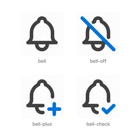
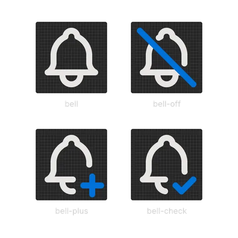
arrow-left,alert-circle,user-plus: object first, then the shape or detail.bell-off,folder-plus,circle-check: common suffixes for a crossed out, added or checked version.brand-github: every logo starts withbrand-.ghost-2,ghost-3: a number marks another drawing of the same object.
A suffix adds a small mark to the base icon. The base shape leaves room for it, usually in the bottom right corner, and a slash for -off crosses the whole icon.
Request an icon
If an icon is missing from the set, request it in the Tabler Icons issue tracker. First search tabler.io/icons and the existing issues, including closed ones. If someone already asked for the same icon, add a 👍 to that issue instead.
The request form asks for:
- Icon name: what the icon should show.
- Use cases: at least two real situations where you need it.
- Design ideas: simple examples from other icon sets, or your own sketch drawn with the rules on this page.

